Why CRI 95+ changes everything in an interior
A high colour rendering index is not marketing. It is the difference between a space that feels natural and luxurious and one that feels cheap and tired.
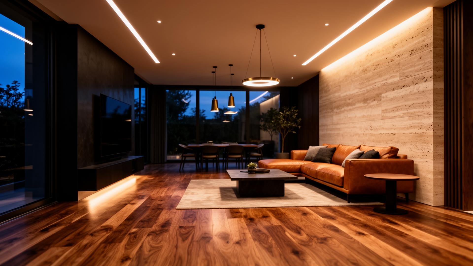
The colour rendering index (CRI) decides whether oak looks like oak and leather like leather. Here is the difference between CRI 80, 90 and 95+ in real examples.
1. What CRI is
CRI (Colour Rendering Index) is an internationally recognised metric that measures how faithfully an artificial light source renders colours compared with a reference source — typically daylight. The scale runs from 0 to 100, where 100 means perfect, natural colour reproduction.
In practice we encounter three levels: CRI 80 (standard commercial LED fixtures), CRI 90 (good architectural fixtures) and CRI 95+ (the premium segment intended for demanding residential and commercial interiors). The number on the box is not a cosmetic detail — it directly determines how materials, surfaces and skin will look in your space.
„CRI does not measure the amount of light. It measures how truthfully that light reveals materials."
2. Why CRI 80 is not enough in a quality interior
At CRI 80, a significant slice of the spectrum is missing — especially in the red and deep-green wavelengths. You feel the result even when you can't name the cause: the room looks flat, materials lose depth, the overall impression is „cold“ or „cheap“.
- An oak floor loses its natural grain and reads as a matte laminate.
- Travertine and marble look grey and lose their mineral depth.
- Leather on the sofa greys out, losing its warm brown tone and pore texture.
- Clothing in the wardrobe shifts in hue — what you put on at home looks different outside.
- Food in the kitchen feels off: a tomato greys, meat looks older than it is.
For a home with wooden floors, stone cladding and quality textiles, CRI 80 is the equivalent of buying a luxury car with cheap summer tyres — the investment loses its meaning.
3. The difference between CRI 90 and CRI 95+
The jump from 80 to 90 is dramatic. The jump from 90 to 95+ is subtler — but equally decisive. At CRI 95+ you start to see what the designer originally intended: the soft tonal gradient in a veneer, the micro-relief of travertine, the play of shadow inside a fabric weave.
The key supplementary metric is R9 — the rendering of saturated red. Standard CRI is the average of eight colours; R9 is not part of that average. Yet red is the most important wavelength for true skin tone, wood and every warm material. Premium fixtures state R9 ≥ 90, while cheaper LEDs often sit below 50 — which is why skin looks tired under them.
„At CRI 95+ with R9 above 90, materials regain their own identity. Oak looks like oak, leather like leather, skin like skin."
4. Where CRI 95+ matters most
- Luxury residences — penthouses, villas, apartments with premium materials.
- Kitchens — faithful rendering of food and natural-stone worktops.
- Fashion Retail and showrooms — the customer must see the product's true colour.
- Galleries and private collections — true pigment rendering in artworks.
- Wellness, bathrooms and walk-in wardrobes — true skin tone for make-up and grooming.
- Hotels and Fine dining — atmosphere stands or falls with the quality of light, not its quantity.
5. The most common investor mistake
We see it again and again: a client invests tens of thousands of euros in an oak floor, stone cladding, a bespoke kitchen and an Italian leather sofa — then lights the whole space with cheap CRI 80 LED downlights bought at a DIY store.
The effect is brutal: expensive materials stop „working“. The space ends up looking like an office or a catalogue flat. The price gap between a CRI 80 and a CRI 95+ fixture is typically 20 – 40 % per piece — across a full project, a few hundred to a few thousand euros. Compared with the spend on materials, it is a rounding error that decides whether the investment ever shows.
„Materials without the right light are like a painting in the dark. They exist, but nobody sees them."
6. In closing
CRI 95+ is not a technical luxury for connoisseurs. It is the basic condition for a well-designed interior to work the way it was meant to. Good light does not draw attention to itself — it works in the background and gives the space its true face.
„Good light does not draw attention to itself. It highlights the architecture, the materials and the atmosphere of the space."
Premium Light Studio
We design lighting with focus on the quality of light, not just on fixture wattage.
Discuss a project